I have begun to develop the z-axis by plotting each city according to its time-distance in the z plane. Thus, each city has x, y, and z coordinates all related to travel-time. The isochrones in this plane are linear, where 1 "z isochrone" is equal to 2 "x-y isochrones" (the concentric circles).
After plotting the cities in this plane, I constructed a nurbz surface to bring cohesiveness to the scattered nodes. Click and drag in the window below to view this surface.
Monday, October 30, 2006
Wednesday, October 25, 2006
Monday, October 23, 2006
Friday, October 20, 2006
Monday, October 16, 2006
Mapimation Update-- 3D
Instead of introducing a new data set to create a third dimension to my mapimation, I have decided to develop the same morphing in the third dimension by extruding the geographic map up to the skewed travel-time map. I will also animate the lines emanating from the hub (in this case London), to show the transformation in a linear manner. In this way, both modes of the map can be seen at once on different planes.
The development of this plan up to this point is shown below.
Screenshots:


Keyframes:
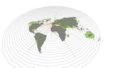
Keyframe 0: Geographic (or actual) configuration with green continents beginning to emerge.

Keyframe 1: Continents begin to morph into the travel-time plane as they are extruded from the geographic map.

Keyframe 2: New shapes of landforms begin to take shape-- a new surface is defined.
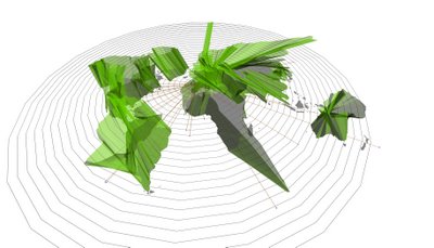
Keyframe 3: End. Full extrusion and fully-morphed travel-time surface.
There is still much to be done. As I'm sure is obvious from the keyframes above, a good deal of clarity was lost in the extrusion. I hope to find a clearer way to render and animate this. The distinction between the two planes (true location and time location) needs to be emphasized in some way. Also, animating the emanating lines is yet to be done, as well as continuing the entire process with hubs at Tokyo and NYC. (I have chosen London, Tokyo, and NYC, because they are considered to be "global cities," also they are far enough apart (geographically) so that significant comparisons may be made.)
Animation:
The development of this plan up to this point is shown below.
Screenshots:


Keyframes:

Keyframe 0: Geographic (or actual) configuration with green continents beginning to emerge.

Keyframe 1: Continents begin to morph into the travel-time plane as they are extruded from the geographic map.

Keyframe 2: New shapes of landforms begin to take shape-- a new surface is defined.

Keyframe 3: End. Full extrusion and fully-morphed travel-time surface.
There is still much to be done. As I'm sure is obvious from the keyframes above, a good deal of clarity was lost in the extrusion. I hope to find a clearer way to render and animate this. The distinction between the two planes (true location and time location) needs to be emphasized in some way. Also, animating the emanating lines is yet to be done, as well as continuing the entire process with hubs at Tokyo and NYC. (I have chosen London, Tokyo, and NYC, because they are considered to be "global cities," also they are far enough apart (geographically) so that significant comparisons may be made.)
Animation:
Thursday, October 12, 2006
Presentation Methods
Vyew's strength seems to be in its sketch features, and Breeze's strength seems to be in its desktop sharing feature. I think Breeze is worth another shot, because I think we only tried a couple of the options for presenting. Skype definitely seems to be the best for voice communication. I've found using Vyew in conjunction with Skype to be excellent for desk crits.
Although, so far fellow students and the manual have helped, it would be nice to somehow have real-time help with FormZ from Ron when needed.
Although, so far fellow students and the manual have helped, it would be nice to somehow have real-time help with FormZ from Ron when needed.
Sunday, October 08, 2006
Mapimation Pin-Up
Here is what I have done so far and how I got there:
I began by choosing a system for mapping based on isochrones, concentric circles representing periods of time (in my case 1 isochrone=1 hour). The methods are similar to those by Oskarlin and Carden.
I cut up a printed map into continents and arranged them according to different isochronic values to determine the clearest representation. I decided on the distance from London to NYC to be the basis for all other measurements.

After this, I chose cities from six continents proportional to their land area.
Cities Sampled:
Asia: 33.1%, 22 cities (14 plotted so far)

Next, I redrew the map by pulling and stretching the existing boundaries according to the new position based on travel time. I then imported this information into FormZ to animate the morphing of the map from the geographic configuration to the the travel-time configuration.
Beginning: Geographic

End: Non-geographic

How the animation actually turned out was somewhat accidental and not entirely accurate, but interesting enough to post.
More images:


The circles in this close-up represent cities: orange = geographic location, blue = travel-time location.
Besides revising the model to improve its accuracy, I intend to model the topography of the countries to add a third dimension of transformation. How to actually tackle this is yet to be determined. I also hope to try the same mapping using other cities as hubs, particularly New York and Tokyo. This will hopefully allow for some interesting comparisons.
I noticed that the time proximity of locations is most often based on the frequency of travel, and this in most cases is a function of the city's population and developent. For instance, it takes about the same time to fly from London to Tokyo as it does to New Delhi even though the cities are a few thousand miles apart. This mapimation is an interesting visualization of the conceptual shrinking of the globe due to globalization. With a society increasingly focused on time, and technology continually closing the gap between location and time, this concept is becoming more and more relevant.
I began by choosing a system for mapping based on isochrones, concentric circles representing periods of time (in my case 1 isochrone=1 hour). The methods are similar to those by Oskarlin and Carden.
I cut up a printed map into continents and arranged them according to different isochronic values to determine the clearest representation. I decided on the distance from London to NYC to be the basis for all other measurements.

After this, I chose cities from six continents proportional to their land area.
Cities Sampled:
Asia: 33.1%, 22 cities (14 plotted so far)
- Moscow
- St. Petersburg
- Jakutsk
- Beijing
- Hong Kong
- Tokyo
- Seoul
- Riyadh
- New Delhi
- Bangkok
- Singapore
- Brunei
- Shanghai
- Novosibirsk
- Cairo
- Cape Town
- N'Djamena
- Niamey
- Freetown, Sierra Leone
- Luanda
- Morovia
- Dakar
- Rabat
- Tunis
- Lusaka
- Antananarivo
- NYC
- Denver
- Los Angeles
- Vancouver
- Winnipeg
- Anchorage
- Miami
- Mexico City
- Nuuk, Greenland
- San Jose, Costa Rico
- Reykjavik
- Brasilia
- San Paolo
- Quito
- Lima
- La Paz
- Caracas
- Beunos Aires
- Santiago
- Paris
- Oslo
- Madrid
- Athens
- Kiev
- Perth
- Darwin
- Brisbane
- Wellington

Next, I redrew the map by pulling and stretching the existing boundaries according to the new position based on travel time. I then imported this information into FormZ to animate the morphing of the map from the geographic configuration to the the travel-time configuration.
Beginning: Geographic

End: Non-geographic

How the animation actually turned out was somewhat accidental and not entirely accurate, but interesting enough to post.
More images:


The circles in this close-up represent cities: orange = geographic location, blue = travel-time location.
Besides revising the model to improve its accuracy, I intend to model the topography of the countries to add a third dimension of transformation. How to actually tackle this is yet to be determined. I also hope to try the same mapping using other cities as hubs, particularly New York and Tokyo. This will hopefully allow for some interesting comparisons.
I noticed that the time proximity of locations is most often based on the frequency of travel, and this in most cases is a function of the city's population and developent. For instance, it takes about the same time to fly from London to Tokyo as it does to New Delhi even though the cities are a few thousand miles apart. This mapimation is an interesting visualization of the conceptual shrinking of the globe due to globalization. With a society increasingly focused on time, and technology continually closing the gap between location and time, this concept is becoming more and more relevant.
Wednesday, October 04, 2006
First Desk Crit in the SUMO
The desk critique on Monday went well in the SUMO. The noise reduction seems to be working well and my only complaint would be that it was a little warm while inside. Vyew worked well for quick sketches during the desk crit. A more sophisticated sketching program or stylus would improve the clarity, but so far it has been fine.
I received direction on how to map travel-time globally. Hopefully now I can move from tracing data towards a mapping that gives the concept of mapping based on time a more visually concrete presentation. I think that I will choose key locations, such as major cities, to serve as the hubs for the mapping. I am still researching methods and data sources as well as considering using flash or other similar programs to create an interactive mapping. A mega-blog post on this topic is forthcoming.
I received direction on how to map travel-time globally. Hopefully now I can move from tracing data towards a mapping that gives the concept of mapping based on time a more visually concrete presentation. I think that I will choose key locations, such as major cities, to serve as the hubs for the mapping. I am still researching methods and data sources as well as considering using flash or other similar programs to create an interactive mapping. A mega-blog post on this topic is forthcoming.
Tuesday, October 03, 2006
Global Travel-Time
Mapping travel-time between locations is a rather undeveloped mapping technique that is used most commonly to provide commute information for city dwellers, but seems to have greater potential in a non-geographic re-mapping of the globe.
The London Tube mapping, by Tom Carden is an example of a travel-time map focused on re-mapping the city's subway system. The technique used in this mapping requires the user to select different nodes from the geographic map. Once the node is selected the tube lines morph according to the time it takes for an individual to travel to any of the other nodes from the selected point.
Another London Tube mapping project by Chris Lightfoot and Tom Steinberg includes several mappings, one of which compares the travel-time for car versus rail transportation. Their study also sights many potential uses for this new method of mapping:
Another attempt of remapping of the globe based on time is the Personal World Map, a project of Roxana Torre at Piet Zwart Institute in Rotterdam, which is an interactive online map that allows you to select a starting city from the map and then watch the map reconfigure itself according to the travel time from that point. Then you are able to type in an amount of time and money to see the distance and locations one would be able to travel to with the given resources.
I forsee this type of mapping becoming increasingly relevent and widely used as a visualization of globalization. My mapping seeks to further explore this potential.
The London Tube mapping, by Tom Carden is an example of a travel-time map focused on re-mapping the city's subway system. The technique used in this mapping requires the user to select different nodes from the geographic map. Once the node is selected the tube lines morph according to the time it takes for an individual to travel to any of the other nodes from the selected point.
Another London Tube mapping project by Chris Lightfoot and Tom Steinberg includes several mappings, one of which compares the travel-time for car versus rail transportation. Their study also sights many potential uses for this new method of mapping:
- tool for deciding where to live/work
- tool for deciding where to travel on vacation with time parameters
- travel times could determine housing prices
- service for commuters
Another attempt of remapping of the globe based on time is the Personal World Map, a project of Roxana Torre at Piet Zwart Institute in Rotterdam, which is an interactive online map that allows you to select a starting city from the map and then watch the map reconfigure itself according to the travel time from that point. Then you are able to type in an amount of time and money to see the distance and locations one would be able to travel to with the given resources.
I forsee this type of mapping becoming increasingly relevent and widely used as a visualization of globalization. My mapping seeks to further explore this potential.
Subscribe to:
Comments (Atom)


